The Sketch Book Files

Meet Jen!

Jen's spot for inspirations, inside her life as designer and artist. I share progress, tips on sources, spaces that inspire and how to push the boundaries of every space.

Be brave, and go for it.

xo, Jen

Posts in Modern Kitchen
Spotlight: San Francisco Modern Project

Last month, we officially wrapped up our SAN FRANCISCO MODERN project. This project was truly a labor of love. We completely transformed a San Francisco row house kitchen, family room, and living room—all during the height of COVID.

To transform the space from being stuck in the tumbled-brick era of the early 2000’s to fresh, sophisticated, and modern, we capitalized on the natural sunlight and moved the sink to face the window rather than the wall. We also devised an out-of-the-box approach to the classic kitchen island, installing a custom bench seating area that established the kitchen area as a distinct space from the family room area.  The fireplace surround was updated with a bold high movement stone to offset the quiet textured wallpaper. This area was also flanked by custom built-in shelving, storing an extensive board game collection for family game night.  We worked with pro photographer Christopher Stark to capture the essence of the space.

Interested in working with us on an upcoming project? Email us at contact@jentalbotdesign.com

Monochromatic Paint Palettes

Author: Sydney Piwowar

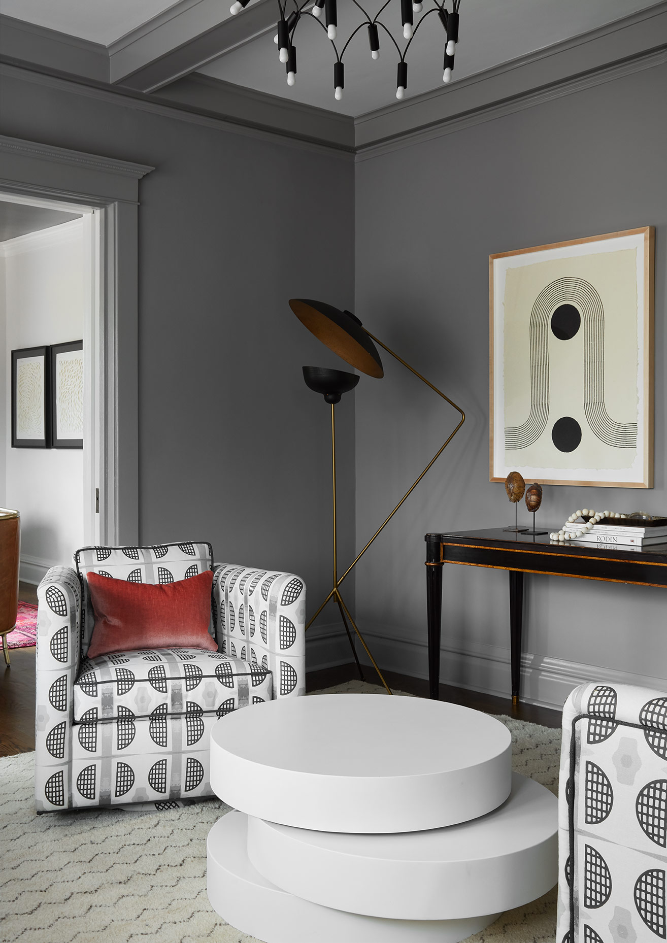
Something designers across the board talk a lot about is color depth. Whether that is in space, graphics, photography, fashion, etc. it is all very similar. In interiors, people often confuse color depth with having lots of colors. The more is not always merrier people! These monochromatic palettes have me falling in LOVE. Despite each room essentially being painted shades of the exact same color, it creates a sense of visual and architectural depth to a space in a way that just painting it all one color wont do. Take a look at these Inso images to see for your self!

mpp 1.jpg
mpp 2.jpg

I absolutely love the way these different paint colors highlight the architectural significance of this wall. Traditionally, people would choose a floral wallpaper to pop in these panels. I have never been a fan for the obvious choices though - be bold, be different.

mpp 3.jpg

This picture needs no introduction. What a great way to highlight the unique arch of the ceiling without drawing the attention up and away from the bathroom features.
mpp 4.jpg
Top 5 Favorite Zellige Tile Applications

Author: Sydney Piwowar

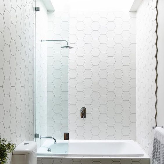
I am sure you have all seen this trend in the 2018 design magazines and Pinterest. Well news for you, it is not going anywhere in 2019. Truth is, after so much technological innovation, we are all craving a sense of hand crafted work in our spaces. These Zellige Tiles are the epitome of that. The mosaic tilework is made from individually chiseled geometric tiles set into a plaster base. This form of Islamic art is one of the main characteristics of Moroccan architecture. To round up some inspiration for you, I have pulled my Top 5 Favorite Applications and specific tile recommendations for those designs.

Bathroom Shower

Cat Skill’s Hayfield Wedding Venue used Cle Tile’s Wheathered White Tile.

zellige 1.jpg
 

Kitchen Backsplash

Nicole Hollis used Cle Tile’s Glossy Black Tile in her Design of the kitchen.

zellige 2.jpg
 

A Nook or Built In

We could not find the source of this design, but pulled a tile we think would we be perfect for this application. The rustic emerald tile in the image looks similar to Riad Tile’s .

zellige 3.jpg
 

Fireplace

Designed by Georgia Ezra, check out her tile collection, Tile of Ezra. She used her own mosaic for this space.

zellige 4.jpg
 

Flooring

For a similar look, check out this 2x6 subway tile from Zia Tile.

zellige 5.jpg
Top 5 Edgy Kitchen Backsplash Ideas

Author: Sydney Piwowar

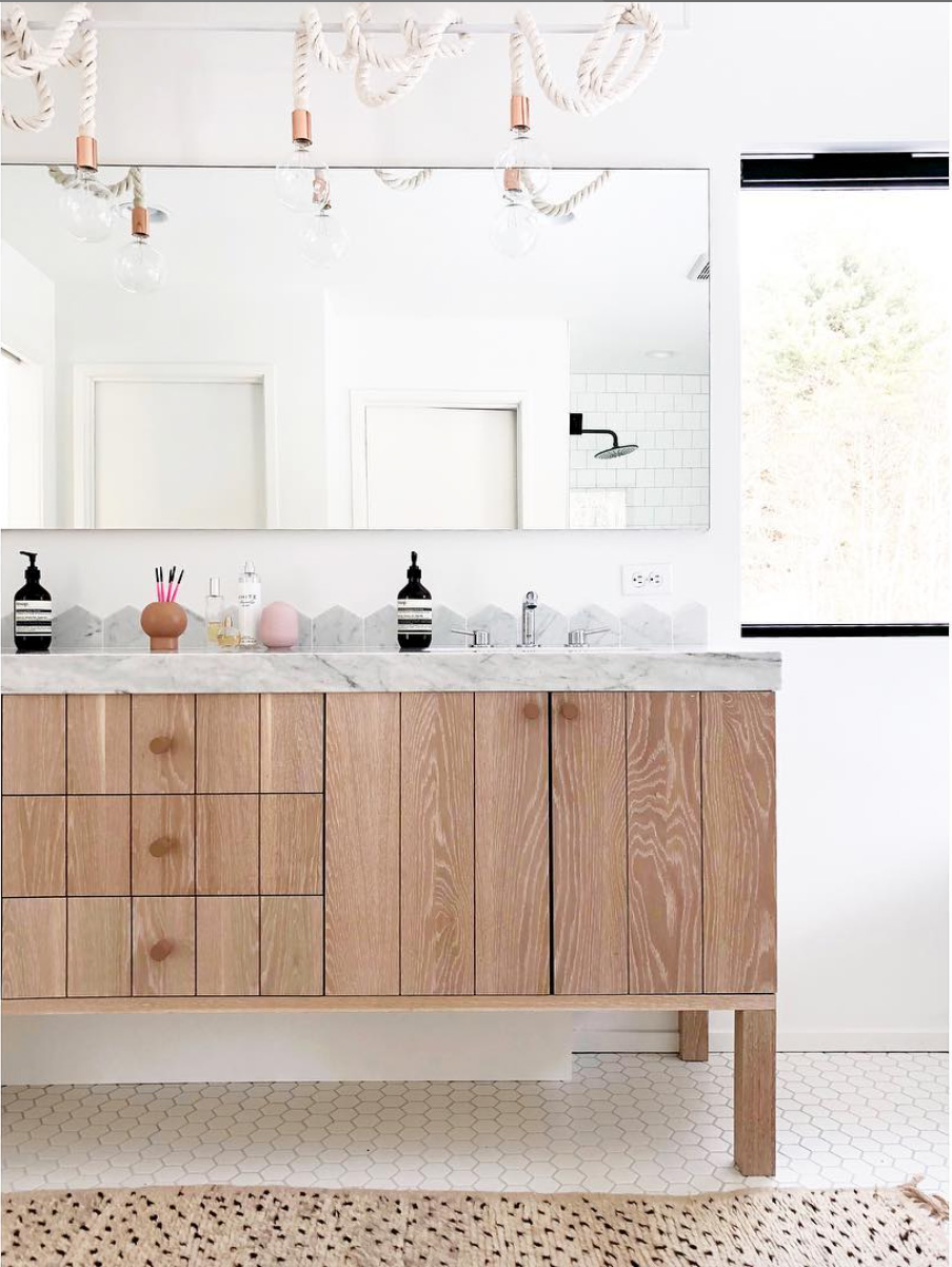
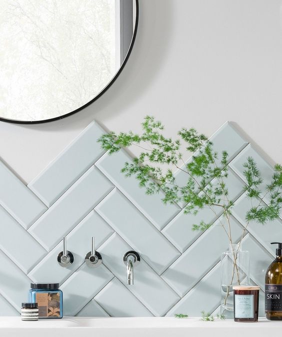
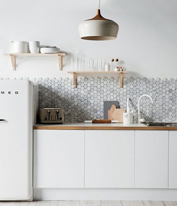
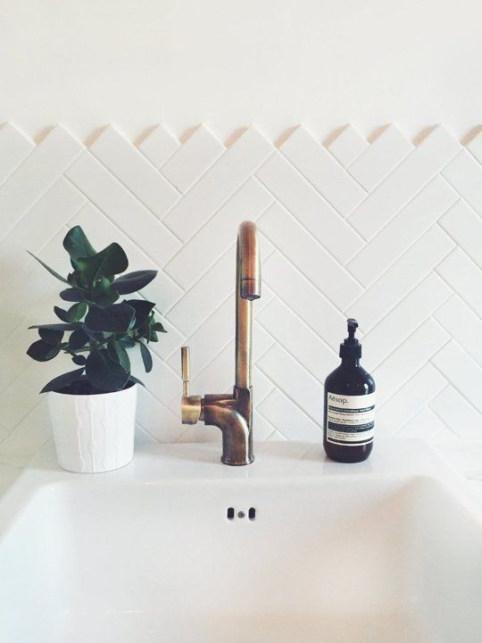
Tired of white subway tile? We are too.. While it is a great budget friendly option, we encourage you to find creative ways to give your space more character. You should feel free to explore color, pattern, and material! Here are our Top 5 Edgy Kitchen Backsplash Ideas to inspire you in your kitchen makeover.


The Unexpected

edgy kitchen 1.jpg
 

The Trend Setter

edgy kitchen 2.jpg
 

The Pattern Lover

edgy kitchen 3.jpg
 

The Luxurious

edgy kitchen 4.jpeg
 

The Glamorous 

edgy kitchen 5.jpg
Exposed Edge Backsplash

Author: Sydney Piwowar

I have been secretly waiting for this trend to gain popularity for years! Because seriously, who actually likes bullnose? It’s not exactly an inspiring way to end tile. To prove how amazing exposed edge tile can be, I have curated a few of my favorite applications below. See more inspiration here, on my pinterest board.

Ottomans To Make you Kick Your Feet Up

Author: Sydney Piwowar

Some people have those rooms where you better not get caught with your feet on the table - we encourage COMFORT at JTD. If you can't live in your home, then your home isn't right for you. Ottomans are essential for kicking up your feet and settling in after a long day. Not only are they very practical, but can be beautiful accessories. Take a look at a few of our favorites for getting cozy this fall!

The best part about ottomans is that in small spaces, they can double as an extra seat! Here are a few sturdy stools we love for their functionality and looks!

For more inspiration, go to our Pinterest page: Ottomans + Stools

How to Add Color in Your Home, Naturally

In the last several years, I've noticed a trend in the striping of color from wardrobes and adding it to environments. Color can be tricky and much harder as a sweater paired with someones complexion. In art school students are first taught to draw in pencil, only using black and white- in order to understand highlights and low lights.  If color is introduced too soon students are not able to get a full understanding of how light affects a shape and ultimately affects the color when finally applied.

The same rules apply when adding color into your space, be thoughtful and selective about which colors and how much color to add.  Pick two colors and keep with those two mixed with neutrals. Feel free to use a variation on tones of the color you picked- meaning not all blue need to match to feel cohesive. If you mix the tones of blue, it will make the space feel more natural. Often times the use of selective color can make that highlighted color stand out more than if a multiple of colors were combined together. 

Be Brave! xo, Jen

add color 1.jpg
add color 2.jpg