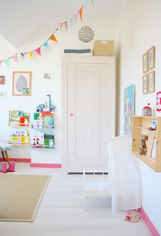
I have an unspoken formula for creating balance in design. I liken it to creating a painting and see the each space as a compressed composition. Critical to not get stuck using all the same type of shapes. Meaning be sure to incorporate some solid, some open, some woven or irregular, some angular. If there are too many pieces that are similar the space can become one note and stale. I like to also use color or the absence of color to function as a visual catalyst. Apply color carefully and thoughtfully.


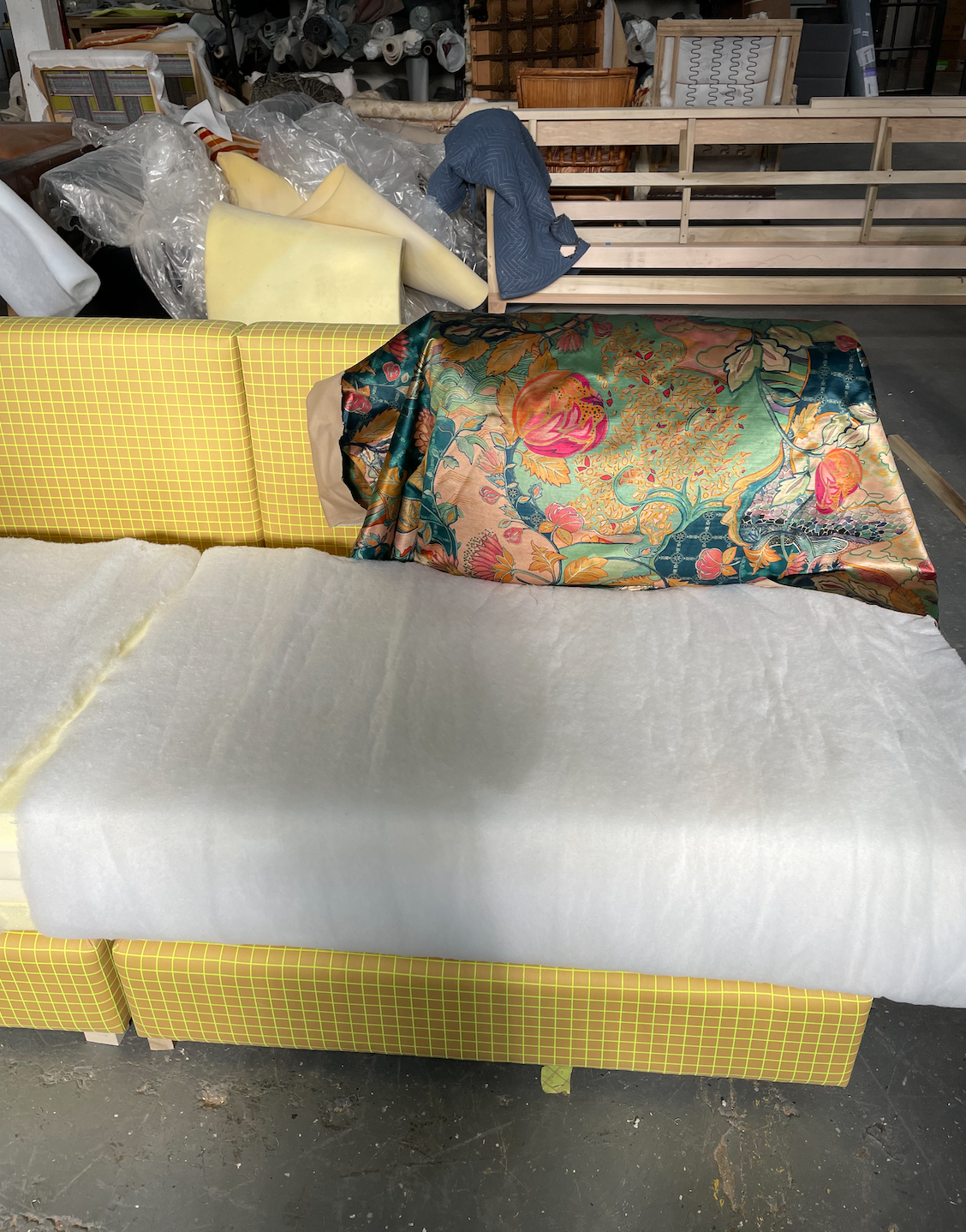
In the last 4 years we have moved to creating more custom furniture because there are better lead times, we can control the quality and creativity of a piece. The success of custom furniture is finding the right upholster or vendor that will listen and willing work with you ideas and ability to execute the craftsmanship.
The first thing we do is figure out the high impact areas that make the most sense for investing in a custom piece. i.e. Does the space create challenging that would be best addresses with a custom piece?
The concepting and drawing is one of the most critical parts of the process. Ensuring the proportions are correct with seat heights, depth. It is important to listen to the guidance of the pros to know about proper seat fill and structure for the achieved comfort level for the needs of the client. We learned a ton by listening to our upholster and reworking with his guidance.
The sit test if one of the most critical parts of the process to make sure all the dimensions on paper translated to the right sit feel and and comfort. Any changes to the framing and seat cushion shape or construction need to be made at this point. We have learned from experience the slight angles needed in either the back slop of the sofa or the back cushion needs to be slight sloped for optimal comfort. We have had to had framing reworked, which cost us additional because we had no slope in the drawing. At this stage the the frame will be finished, but not much else. After the sit test the rest of the cushions will get completed.
The most rewarding parts is the finished product and delivering it to the client!!


The reciepe for great composition is balance of open shape and solid shape.


At the turn of the 20th Century, the Neoclassical Revival was in full swing. Chicago deeply embraced the movement. It represented stability and rebirth after a devastating fire ripped through the city. A style that was once reserved for public buildings trickled into residential homes.
From Hyde Park to the North Shore, our team has several projects on the books to revive these 100+ year old beauties. Rather than replicating a bygone era, we are pumping in fresh ideas. Say goodbye to stuffy wingbacks in dark corners, and hello to soaring ceilings with epic crown moulding! Take a look at our inspiration:
Salvage the intricate moulding and add quirky artwork.

Layer with modern furnishings and accessories. Source link.
You don’t have to live in the Sistine Chapel to enjoy a mural in your home. Overscaled wallpaper can offer the same flair. Check out Ashley Woodson Bailey’s collection of dramatic florals. Source link.
Parquet flooring in bad shape? Consider playing with a more modern pattern, like chevron. Source link.

Author: Sydney Piwowar

Early in our lives have we all overpaid for a sofa that barely lasted 5 years. We all felt the cushions start to cave in after a year in our favorite spot… its heart breaking to waste the money. As designers, we have been trained in this knowledge to make sure you are getting the best bang for your buck in both aesthetics and quality. To help ensure your sofa will withstand the test of life, I have curated a list of 5 Tricks to Make Your Sofa Last Longer.

1. Quality Framing
Be sure to look at the materials and reviews. If you are working with a designer like us, you can be sure we are considering these things when we source for you. That cannot be said for all decorators though so be sure to as blatantly.

2. Cushion Fill
Not all sofa cushion fills are made equally. If you read one of my recent posts, you will see my review of RH’s Cloud Sofa. Though harsh, it was true. Some cushion fills require much more maintenance while others synthetic blend of fibers are self sufficient. Not to say that poly blend it better though - once you find a compression in the cushion, it is not repairable. You will continue to develop a sink hole till you replace the cushion. This is why it is important to find a balance of the two. I prefer a down feather wrapped poly core with more feathers than synthetic fibers. For everyone the ratio of soft to firm will vary with preference though.

3. Check the Upholstery
Faux leathers will age the fastest and the worst in my opinion. Once you form cracks or minor holes from regular use, there is no going back. The second worst is linen. I love linen to death - I love the way the fabric softens with age, the relaxed and welcoming texture it provides… But I do not have kids yet. One drop of mustard, coffee, tea, or red wine and it is game over. There are several fabric lines, like Perennials, who are creating linen look-alikes that feel and appear to have the same texture, but are far more durable. You will find these synthetic blends are farm more stain resistant, resistant to fading, and easier to clean.

4. Rotate Your Cushions
Some cushions are made reversible so that you can flip them over should there be an issue with the upholstery on one side. This is also helpful to do for maintaining the rate of age. If you are able to rotate the cushions, you will be able to stop the one cushion that gets sat on the most from getting trashed before the rest of them.

5. Ask the Manufacturer
Many furniture manufacturers offer lifetime warranties on their products. Even if there is something outside of your warranty, like your dog urinates on your sofa, many offer replacement parts at a fraction of the cost. It is always worth checking with them first before trashing your perfectly good sofa and purchasing new.

Author: Sydney Piwowar
I am sure you have all seen this trend in the 2018 design magazines and Pinterest. Well news for you, it is not going anywhere in 2019. Truth is, after so much technological innovation, we are all craving a sense of hand crafted work in our spaces. These Zellige Tiles are the epitome of that. The mosaic tilework is made from individually chiseled geometric tiles set into a plaster base. This form of Islamic art is one of the main characteristics of Moroccan architecture. To round up some inspiration for you, I have pulled my Top 5 Favorite Applications and specific tile recommendations for those designs.
Bathroom Shower
Cat Skill’s Hayfield Wedding Venue used Cle Tile’s Wheathered White Tile.

Kitchen Backsplash
Nicole Hollis used Cle Tile’s Glossy Black Tile in her Design of the kitchen.

A Nook or Built In
We could not find the source of this design, but pulled a tile we think would we be perfect for this application. The rustic emerald tile in the image looks similar to Riad Tile’s .

Fireplace
Designed by Georgia Ezra, check out her tile collection, Tile of Ezra. She used her own mosaic for this space.

Flooring
For a similar look, check out this 2x6 subway tile from Zia Tile.


Author: Sydney Piwowar
Many of you may remember Jen’s previous post with her Hope for Autism submission. If you didn’t see it, I want to remind you to check it out, here. I bring it up because Jen and I are obsessed with contrast piping. It is such a simple, uncommon, and genius way to add character to furniture. Whether it is a simple color palette or something gold and colorful, we believe it is one of the easiest ways to turn an “eh” piece of furniture into a “WOW” piece. Here are our Top 5 Favorite Applications
1. To emphasize form

2. To give depth

3. To by playful

4. To be different

5. Cause why not?!


Author: Sydney Piwowar
Alright peeps - here is a sensitive topic… Drapes. Some people think that they have a hard and fast rule for drapes and that is not always the case. LESS is not always more and MORE is not always more.. as a general guide line to hanging drapes there are a few mistakes people commonly make. We have curated our list of the Top 5 mistakes
Too Low
Hanging curtains too low from ceiling causes the room to compress. Instantly, the ceiling feels lower, and your space will feel small. Hanging them high to the ceiling tricks your eye into thinking the space is taller, making it feel open and airy.

Too Short
Cutting the drapes short to match the length of the window makes the whole room feel like its floating - in a very bad way. It feels unfinished, like you were on a budget and could only afford 1/2 the fabric you need. Even if you are on a budget, get a fabric in your price range, and do it right. Your space will prove to you its worth it.

Not Enough
Wimpy fabric will feel thin an cheap on a big window. Getting a drapery grade, heavier, and thicker fabric will pay off and make the room feel more luxurious. Even if you don’t want black out curtains, you just want something light and airy, make sure to buy enough extra fabric to gather on each end of the window. You pay for what you get in drapes people!

Too Much
Now don’t get me wrong, I am ALL for vintage. Design trends cycle through like your laundry.. One second its light and airy 80’s summer style, then the next its moody 90’s winter grunge. Drapes are not cheap Forever 21 T-shirts though… You buy them RIGHT once, and keep them forever. That being said, stay away from trendy patterns... No pattern what 70’s mod patterns come back in, don’t do it. Stick with something simple, modern, and clean. Versatility is key.

Arched Window
This is what I meant by no hard and fast rule. Arched windows are so tricky dependent on their size, location on the wall, and quantity. Don’t be discouraged though, there are more than one solution. The first option is to remove those ugly drapery knobs and hang a simple, modern, rod high to the ceiling as previously mentioned. Option 2 is to have custom roman shades made to fill the arch and drape below on the lower, rectangle portion of the window. I am not a fan of that option though as most arched windows have beautiful trim features you don’t want to cover up. Option 3 is no curtains at all. For some people, that may be a deal breaker, but I think it is important to decide when you need privacy and when you don’t.


Author: Sydney Piwowar
As society modernizes, I believe the perception of alcohol in the home does as well. Where once the home parlor was filled with cocktails and conversation, it turned to a plastic covered furniture living room. Now I believe we are in a full swing back to the original cocktail room we all knew and loved. Not every once looking to implement these in-home bars has the ability to add plumbing for a wet bar… This is where the Dry Bar steps in. It is the perfect space to call home for your best drink ware, wines and spirits. To elevate yours to the next level, I have curated 3 tips to make your Dry Bar the topic of the night!
Build It In
I know it isn’t a wet bar, so there is no need for built in components, but is important that it feels integrated into the home. If you are trying to add one into an existing structure, the easiest way to do this is to replace a built-in or unnecessary closet.
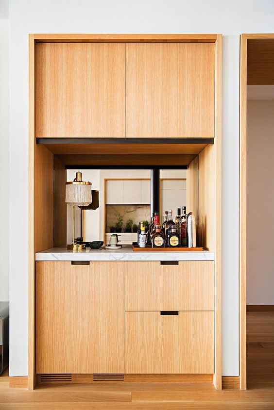
Make It Feel Special
The most unsuccessful dry bars are the ones that feel left over kitchen cabinets you just put in the living room. They key to a good dry bar is to make it feel special. Consider special finishes on the cabinets, an upgraded stone counter top, a backsplash (could be tile, wallpaper, paint, etc.), and even lighting.

Add Lots of Storage
At first it will seem overwhelming because you have not began to curate your collection, but over time you will need it. Whether you need shelves for your Whiskey collection, or racks for your wine bottles, be sure to maximize on storage. Consider how your collection might change over time as well. For example, purchasing more glasses, changing from a red wine to white wine collection, will you need refrigeration?

For more bar ideas, check out my painters page HERE!

Author: Sydney Piwowar
Art is crucial in making a house feel like a home, and good art is not cheap! Nothing ruins your perfectly good piece of art quite like bad nail placement. We have curated the top 3 mistakes that people make when hanging art and are going to share simple solutions.
Hanging Too High

You have most likely hung your art too high, leaving it to float away from the furniture underneath. To tie the pieces together (and make your room more visually harmonious), shoot for roughly five inches of space between the bottom of your art and the top of your furniture.
Small Art in Large Spaces
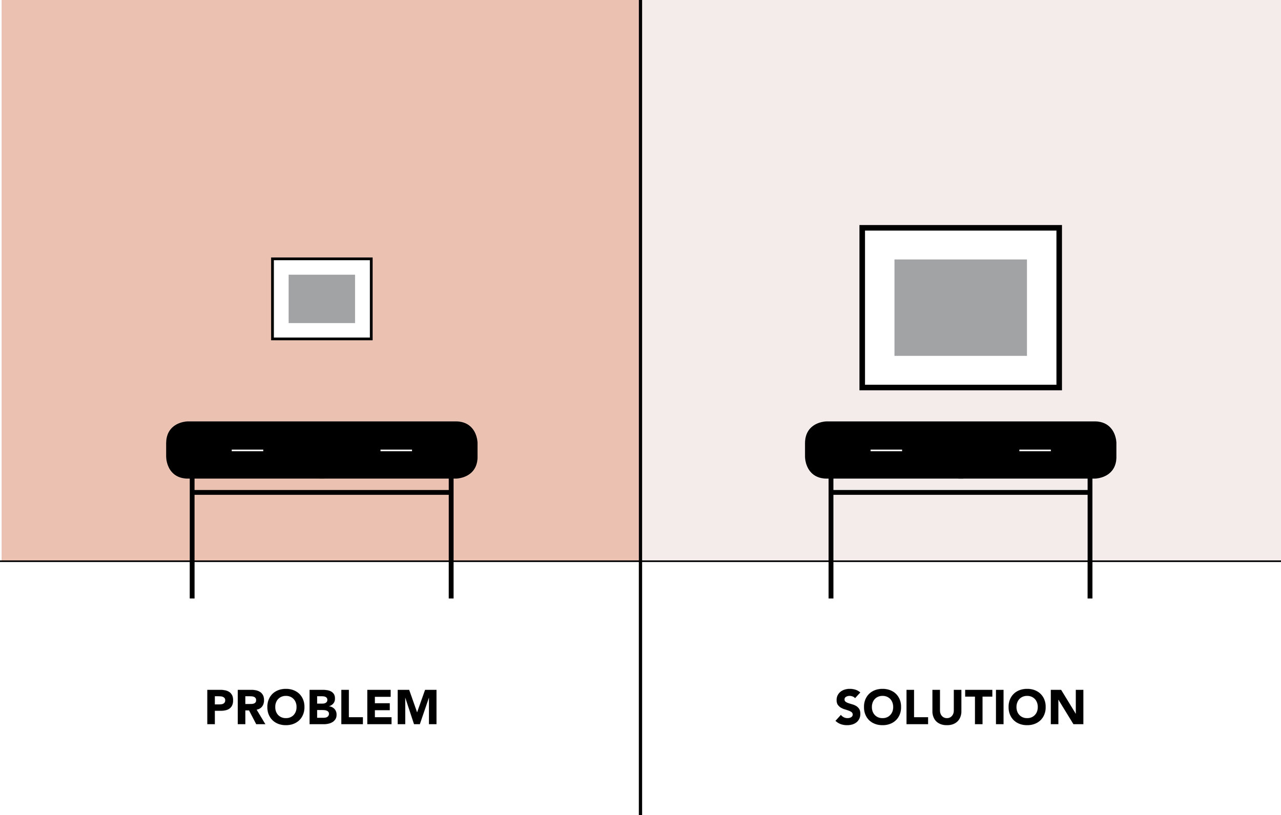
Scale is the key to maintaining a harmonious relationship between the walls and furniture. Using a frame that is too small tricks the eye into thinking that is is smaller than it actually is. An easy trick to make it feel proportional is to reset it in a larger frame or to get a larger piece for the space all together. The general guide you should have when approaching art is to chose pieces that are about two-thirds of the length of the furniture.
Grouping Too Far Apart

Separating your art is like separating fighting kids to their time-out corners… Its awkward for all of us. Whether you’re hanging twin paintings or simply grouping pieces, everything should act as one. Make sure that they are close, separating frames no more than 3 inches apart.

Author: Sydney Piwowar
We all love our families (mostly) and its hard to tastefully show them off. Oversized canvas oil paintings hung over the fireplace aren’t style anymore... At the same time though, I do not think it is fair to cut all evidence of family in a home… it is after all what makes a house, a home. We were asked in a recent install how to do this successfully. Well, I am here to share with you all my secret: framed prints with oversized mattes. Yes, simple and understated. What makes this method unique is the color quality of the image and the placement of it. Here are the 5 steps to ensure your framed prints turn out perfect:
Curate Your Photos
Go through the old hard drive because you want to plan out your photos ahead of time. The photos don’t all have to contain the same colors or people - feel free to change it up. This is where you get to show off your family’s unique characteristics.
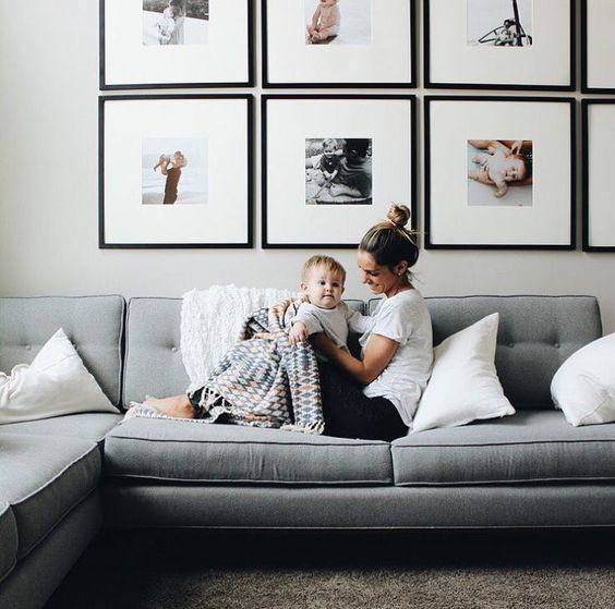
Print With HIGH Quality
The most common mistake that people make is framing pixelated photos. Make sure that you are printing high quality images and don’t be afraid to send them somewhere nice to print - don’t cheap out on this because you will get what you pay for. Something else to consider is if you want to print in color or black and white. For someone who wants to print in color, going to a good printer with high quality color is important.

Find Frames
Frames can be sourced from anywhere. Whether they are custom or ordered online from Ikea, you will notice a large gap in cost. The most influential decision you make will be upon the frame’s finish. This color and texture will be framing the image, literally and figuratively, in a way it is possible to influence your perception. For example, if your image has LOTS of texture and color, choosing a frame that does as well may only distract form the richness of the image. It would be better to chose a simple frame that allows all attention to be focused on the specialness of your image. The second factor to consider is if you want a more unified or eclectic gallery. For a more unified approach, I would consider finding a store that sells the same profile in several sizes as you may need for your collection. For those that want a more mix-and-matched approach, I suggest shopping resale shops, garage sales, and local boutiques for an interesting combination.

Find Matte
There are several colors and finishes to matte. I prefer a stark white matte as it gives a certain freshness. Be careful though as they come in several shades of off-white, ivory, and cream — especially if you are trying to match to previously framed images.

Hang Art
It is hard to generalize for every one when it depends on the size of the frame and the space… My best tip is to map out the wall with painters tape first though to ensure you are happy with your placement — you don’t want to see a dozen holes in the wall from where you moved hung them previously. Some key areas I think it is more peaceful to hang family photos include: hallways, stairways, bedrooms, bathrooms, and basements. Try to stay away from the large print over the living room fireplace — its tacky.

For more tips on how to frame family portraits, see my pinterest board HERE!

Author: Sydney Piwowar
Every parent does the battle once their children are old enough to want to put their own ornaments on the tree. My mom could not bare to let me ruin her perfect, glowing tree. She solved the issue by buying me my own mini tree to keep in my room, away from the holiday party guests. That worked through elementary school when I was still making ornaments out of popsicle sticks, but when hit pre-teen years, I wanted to help with the REAL tree. Being an aspiring designer, I had my own opinion on the color scheme of the tree every year and could not settle for silver, gold, and crystal ornaments. One year it was teal and silver, the next pink and gold, then the colors all combined in year three… the list goes on… As I have grown, I have learned that I was not wrong at age 12. There is no rule book that says Christmas trees must only contain the pre-approved colors: green, red, gold, silver, and glass. This year I am spreading the word — COLOR IS GOOD! Color is exciting and festive! To prove it to you, I have curated images of my favorite colorful Christmas Decorations sure to be approved by both parents and kids.


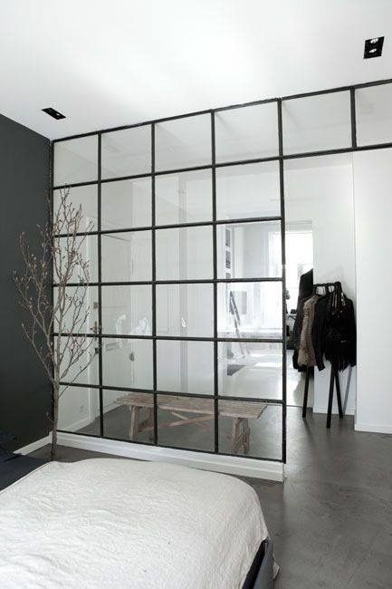
We were all in shock when the trend hit in early 2017 and have been drooling over them since. Black powder coated steel framed glazed partitions. In other words, those beautiful black framed window walls that we are seeing in interior spaces. After the swoon faded, I discovered a very practical issue with these walls… Arent walls supposed to separate spaces and provide privacy? Well, not these ones. The goal of these window walls are to separate zones in space without compromising on light, still maintaining the open feel of the space. To prove it to you, I have rounded up our top 5 favorite PRACTICAL applications for these.
1. Interstitial Spaces

Interstitial spaces can be a pain to design. Often, they become this weird in-between space with no purpose other than to offer a transition in space. These glass walls offers a connection from the outside in, making a smoother and aesthetically pleasing transition.
2. Studio Dividers
Anyone who has ever owned a studio apartment or condo knows the struggle of defining zones within a larger, open space. We have seen endless Ikea temporary hacks, but for those who are in it for the long run, this offers a solution that embraces your small space.
3. Quiet Zones

Since the development of open concept, our clients have come to us with lots of noise control issues. Families are finding that noise carries through the house in unwanted areas. No one wants to hear the kids playing cops and robbers while you’re trying to make a work call in our home office. These glazing walls offer create barrier between spaces, blocking some sound, and separating quiet spaces like your office.
4. Stair Railings
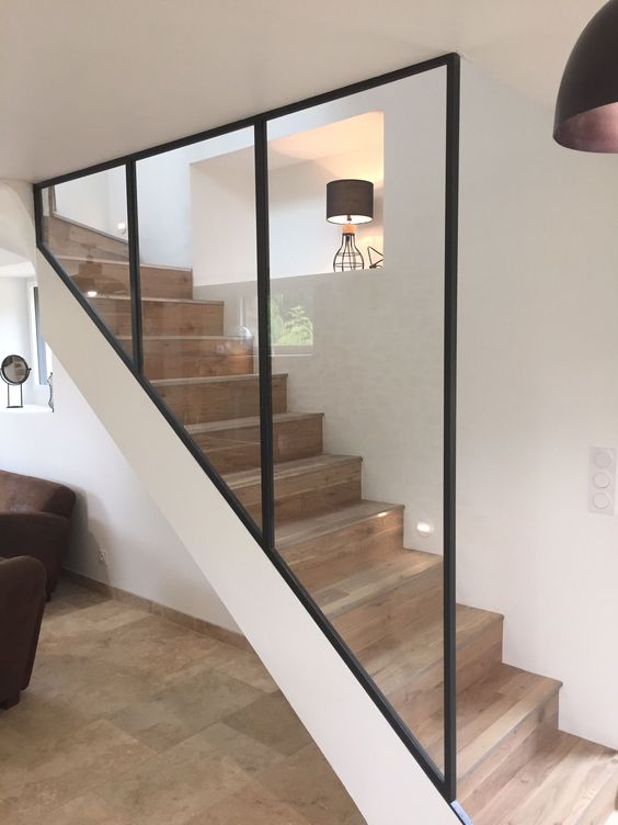
It sounds contradictory to build a wall to open up the space, but this glazing wall offers a protective railing for the stairs without the cluttered, repetitive lines of balusters.
5. Messy Spaces
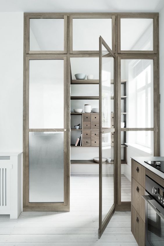
There are some spaces, like mudrooms, that unfortunately receive a lot of light as they are connected to the exterior of the home, but get VERY messy. Frosted glass partitions offer a way to carry in that light without seeing the mess! This can be a great solution for spaces like kids play rooms, pantries, offices, etc.
This is a steel and glass wall we did for a modern condo in the West Loop to split the master bedroom from the main living area. We also had custom cast brass door handles made.


Author: Sydney Piwowar
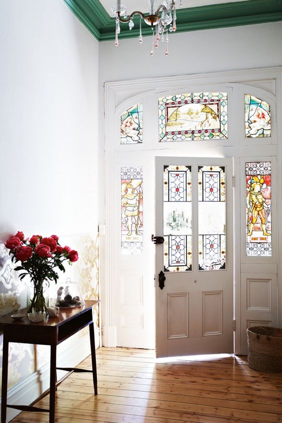
Contrast trim became famous for providing non-contractor grade options for trim. It was a missed opportunity for years to provide another aspect of color and depth to space. Rather than just picking the base grade or what ever is cheapest at Home Depot, we encourage you to put an interesting spin on a building necessity. Here are our current Top 5 Favorite Contrast Trim Colors now.
1. Classy Black
We have all heard of the black trim trend at this point. At JTD, we appreciate the unique ways people are using black in space. Here is a great space where the designer chose to trim a unique white wallpaper with black.

2. Calming Grey
Although providing a visual contrast, this soft grey brings a sense of comfort into the space.
3. Eclectic Green
We love the way this emerald toned trim compliments the original stained glass windows. This is a great way to modernize traditional spaces.
4. Pretty In Pink
If your kids are anything like I was, they constantly want to update their room. An easy, non permanent way to do that is to paint trim. No need for painting or wallpapering whole walls.
5. Buoyant Blue
This soft, baby blue paint color was pulled to compliment the paper pattern.


In the last several years, I've noticed a trend in the striping of color from wardrobes and adding it to environments. Color can be tricky and much harder as a sweater paired with someones complexion. In art school students are first taught to draw in pencil, only using black and white- in order to understand highlights and low lights. If color is introduced too soon students are not able to get a full understanding of how light affects a shape and ultimately affects the color when finally applied.
The same rules apply when adding color into your space, be thoughtful and selective about which colors and how much color to add. Pick two colors and keep with those two mixed with neutrals. Feel free to use a variation on tones of the color you picked- meaning not all blue need to match to feel cohesive. If you mix the tones of blue, it will make the space feel more natural. Often times the use of selective color can make that highlighted color stand out more than if a multiple of colors were combined together.
Be Brave! xo, Jen


I surely hope you have discovered Chairish, the fabulous curated vintage marketplace from vendors across the country. Think of 1st Dibbs meets Etsy, which is a happy mix of vintage retailers and every day individuals that have an amazing piece to sell. It's a great place to find an original pieces to introduce in a unique element in to your to space to make it that much more personalized.
It also can be a huge time saver, not having to drive around to all the local places that may be a big miss depending on the current inventory. The only draw back is you have to pull the trigger fast on finds from Chairish because they sell out quick.
Here is my current favorite round up that would be great for a modern living room.

Top row: Black + White print, Blush Modern Accent Chairs
Second Row: Mid Century Modern Velvet Day Bed , Bohemian Wood Hand Sculpture , Mid Century Desk Lamp
Third Row: Architectural Coffee Table , Charcoal and Pink Moroccan Ottoman
Forth Row: Vintage Rug , Vintage Usher Bandages , Side Table