We just wrapped up a great home office makeover. This is not your average home office. This space was craved out of the space above the detached garage by the previous owner, but remained uninspired until we got our hands on it. We had a local artist paint a mural of a humpback whale, installed a light installation. We also incorporated muted green built in’s into an awkward side room. This providing natural office storage. Check out below.


We are so excited about our recent install- we can barely contain ourselves. The space previously was a dated space stuck in 90's, with rounded walls and random suspension cable tracks lights. We gutted the loft, including every bathroom, ripped out the old gym style railing with a fresh clean modern version and replaced a curved wall leading into the master bedroom with a open concept steel and glass wall- punctuated by a dramatic white curtain.
We still have yet to professionally shoot the space. Stay tuned that is slated for end of August!


We just wrapped up one of our favorite bathrooms to date! With twins and older brother started to out grow the families current bathroom situation, we revamped a former laundry room for the girls bathroom (details in another post to come) and renovated the existing bathroom to focus on the tween boys and a space they could grow into.
We fell in love with this plaid stone tile, which became the jumping off point for inspiration for the rest of the space.
Can we all collectively say #bathroomenvy?!


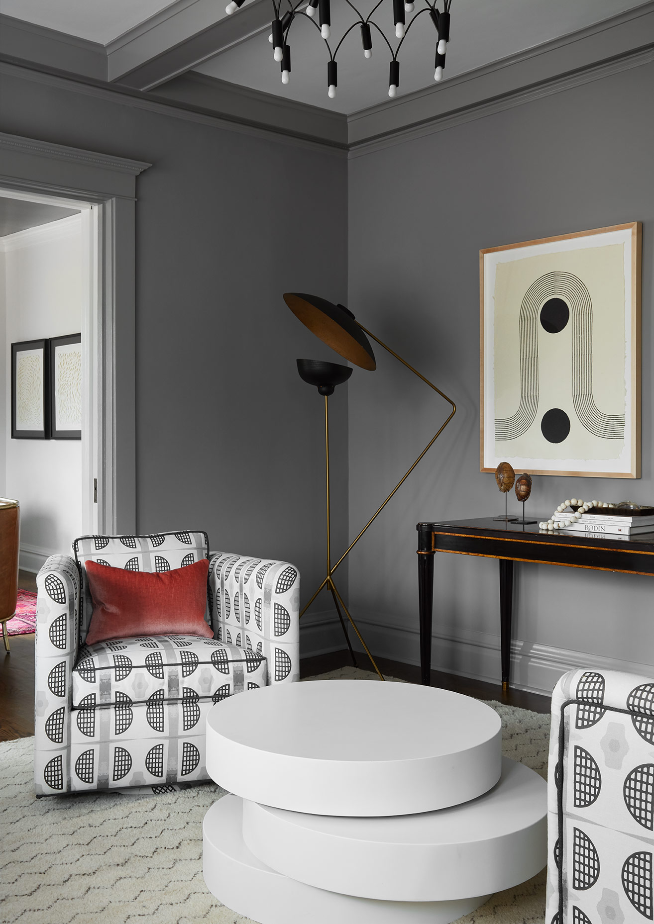
In the last several years, I've noticed a trend in the striping of color from wardrobes and adding it to environments. Color can be tricky and much harder as a sweater paired with someones complexion. In art school students are first taught to draw in pencil, only using black and white- in order to understand highlights and low lights. If color is introduced too soon students are not able to get a full understanding of how light affects a shape and ultimately affects the color when finally applied.
The same rules apply when adding color into your space, be thoughtful and selective about which colors and how much color to add. Pick two colors and keep with those two mixed with neutrals. Feel free to use a variation on tones of the color you picked- meaning not all blue need to match to feel cohesive. If you mix the tones of blue, it will make the space feel more natural. Often times the use of selective color can make that highlighted color stand out more than if a multiple of colors were combined together.
Be Brave! xo, Jen