I have an unspoken formula for creating balance in design. I liken it to creating a painting and see the each space as a compressed composition. Critical to not get stuck using all the same type of shapes. Meaning be sure to incorporate some solid, some open, some woven or irregular, some angular. If there are too many pieces that are similar the space can become one note and stale. I like to also use color or the absence of color to function as a visual catalyst. Apply color carefully and thoughtfully.


I know we are not the only ones completely girl crushing on Kelly Wearstler. Let’s breakdown why we love her:
The Colors Are Just Right- She has an innate balance and eye for the right color. For example, It always seems like fresh new shade of cream. She is not inviting the wheel, she just demands for excellence in tweaking until it in 100% right.
The Proportions Are On Point- She plays with scale, that is with intent and creates interesting visuals. For example, by creating a back of a chair that seems over sized and even disproportionate to the rest of chair is interesting.
Draws From History- She pulls inspiration from line, shape and textures from her travels to Morocco, France and Italy, etc. If you know architecture the lines she uses are simple shapes distorted, again by scale, to create something innovative. She also pulls inspiration from vintage pieces from the 60’s, 70’s and 80’s. These are not decades that have been reworked so much that they seem tired. Unlike our friend mid-century modern, that has been living among us for 20+ years. It is so dead. The 70’s and 80’s feel fresh again. Of course she is also extracting the best parts of your eras and modernizing it.


I will forever have a soft spot for vintage rugs. But at one point in time and perhaps in a near future they will all be collected and sold. They will be gone. It has been harder to and harder to find the special ones that stand out from the usual. Here are a couple we have loved and used over the years. This is my favorite source.

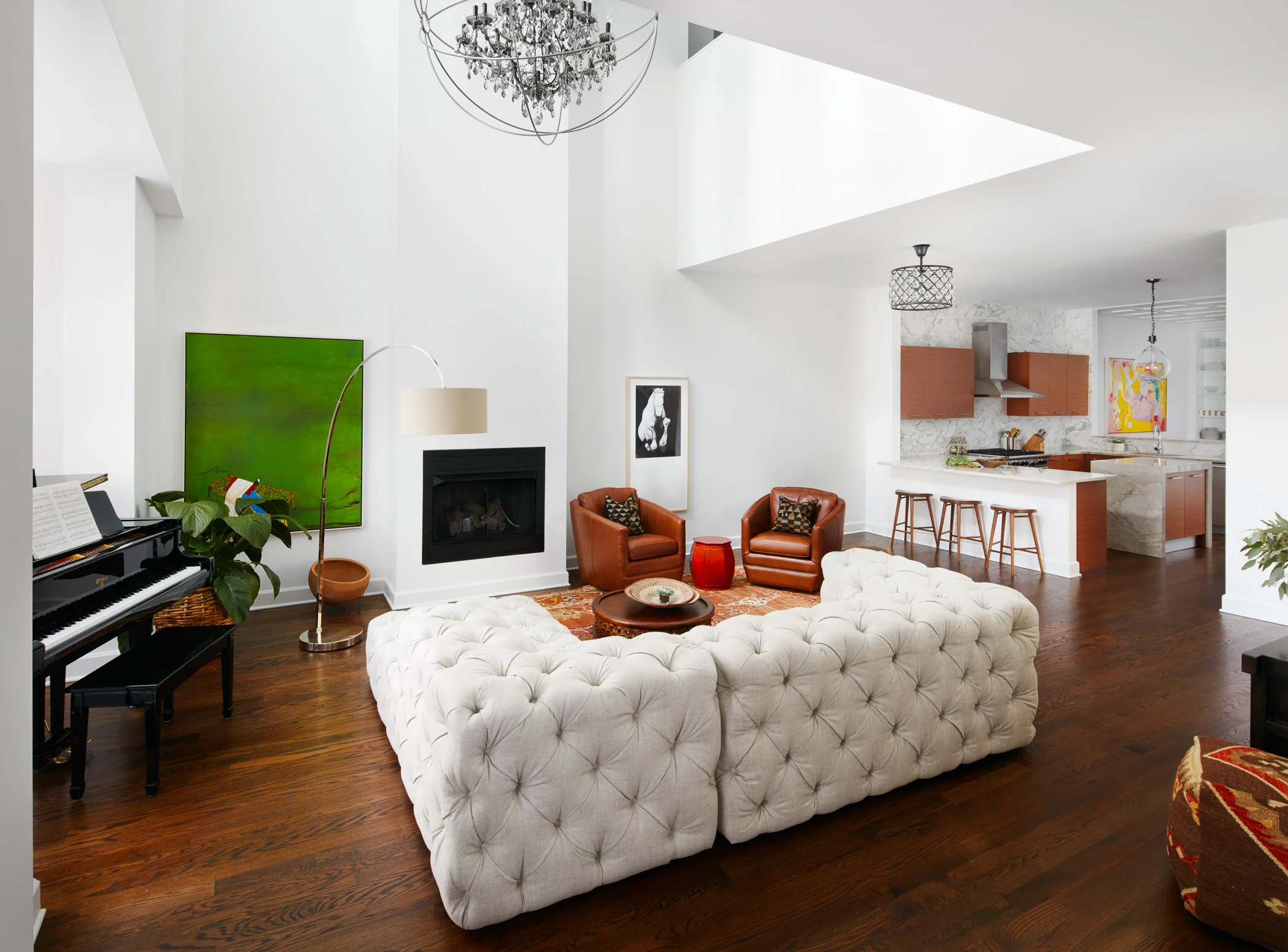
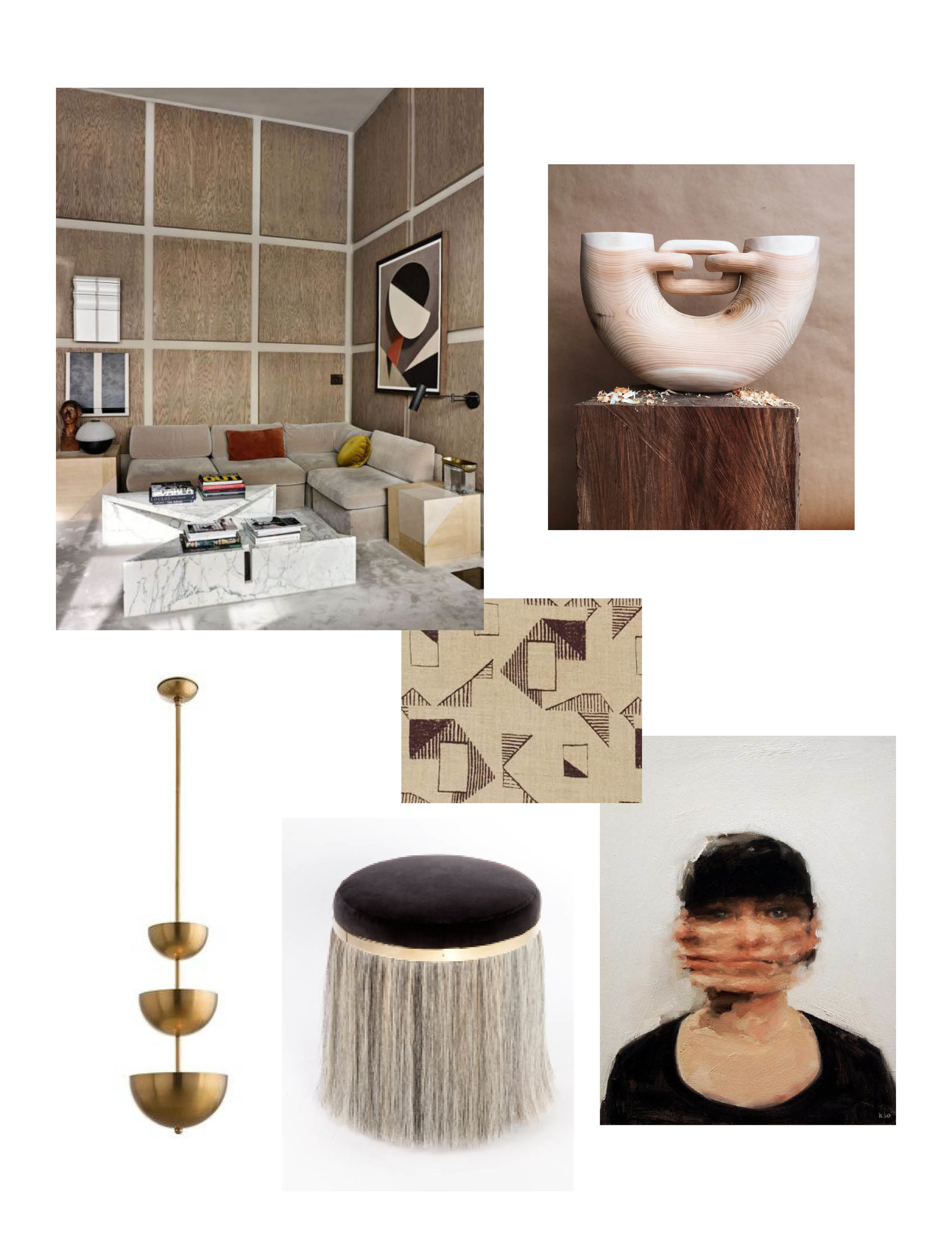
Wilmette Livingroom
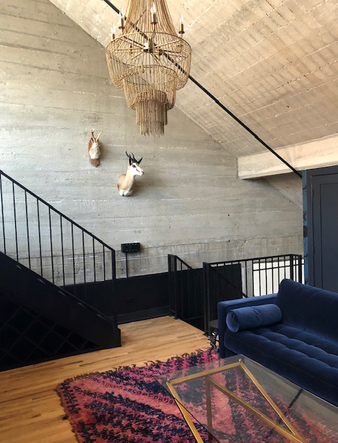
Adam St Loft

Wilmette Family Room

Bucktown Modern

Author: Sydney Piwowar
Endless times have clients requested the cloud sofa. While the 100% down feather filled cushion wrapped in your “custom” choice of upholstery sounds lovely on paper, it does function as lovely in real life. Clients are often drawn towards the modern and relaxed look of the cloud. While there is nothing wrong with modernity and a relaxed setting, this sofa creates a lot of stress due to its construction.
The first, simpler issue is that the oversized frame makes it difficult to install in homes - you need to double check your door widths to ensure it will fit in your home.
Taller clients, or those that like to cuddle up and watch movies on their sofa, are often attracted to the oversized depth of the sofa. Deep cushions are actually one of the things RH is famous for. While you may think the cloud is cuddly and wraps you like a hug, your grandmother or great aunt might think different. Comparable to a bean bag chair, this sofa sits very low to the ground and is very hard to get out of.
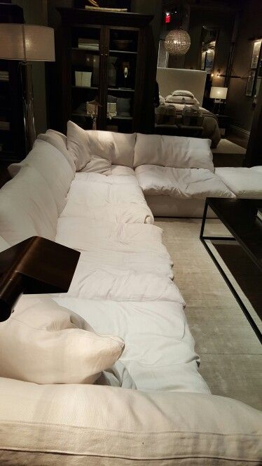
Its 100% down feather cushion fill does not help with this either. Each time you sit on it, the feathers relax and compress, similar to your down feather bedding. Only issue is that since there are so many feathers needed to fill it, its own weight compresses it down and doesn’t allow it to fluff back up after you sit up. As a result, each sofa cushion should be regularly fulled after every use to ensure it keeps its fluff. If that wasn’t annoying enough, try lifting one of those cushions yourself. If you don’t believe how much these feathers can weigh, stop by an RH near you and try for yourself. You are NOT going to want to lift that daily.
This blog post isn’t meant to bash Restoration Hardware. I simply believe you have the right to know these things that sales associates won’t share with people willing to spend $14K on a sofa.
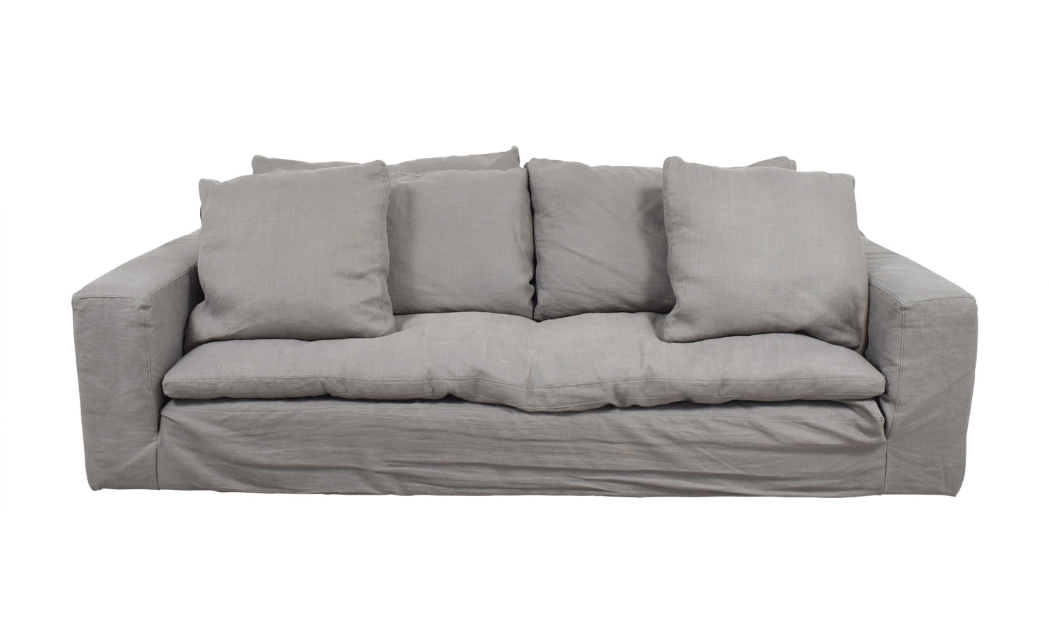
Since I am being honest with you, I should tell you that 100% linen upholstery on this sofa is also a nightmare. Since the sofa does not bounce back once you sit in it, the fabric stays depressed and wrinkles with every touch. Not to mention, linen is also a stain magnet for children.
To summarize, remember that bigger is not always better. Remember to check your cushion fill to ensure you have the appropriate balance of synthetic materials and down. It should be noted that the exact percentage will be different based off of personal preferences. And always bring home a sample of fabric before you agree to custom terms of agreement. Rub it on your dog to see how much hair it collects, let your two year old play with it for an afternoon and see how hard it is to clean - you will not regret it.

In the last several years, I've noticed a trend in the striping of color from wardrobes and adding it to environments. Color can be tricky and much harder as a sweater paired with someones complexion. In art school students are first taught to draw in pencil, only using black and white- in order to understand highlights and low lights. If color is introduced too soon students are not able to get a full understanding of how light affects a shape and ultimately affects the color when finally applied.
The same rules apply when adding color into your space, be thoughtful and selective about which colors and how much color to add. Pick two colors and keep with those two mixed with neutrals. Feel free to use a variation on tones of the color you picked- meaning not all blue need to match to feel cohesive. If you mix the tones of blue, it will make the space feel more natural. Often times the use of selective color can make that highlighted color stand out more than if a multiple of colors were combined together.
Be Brave! xo, Jen


I surely hope you have discovered Chairish, the fabulous curated vintage marketplace from vendors across the country. Think of 1st Dibbs meets Etsy, which is a happy mix of vintage retailers and every day individuals that have an amazing piece to sell. It's a great place to find an original pieces to introduce in a unique element in to your to space to make it that much more personalized.
It also can be a huge time saver, not having to drive around to all the local places that may be a big miss depending on the current inventory. The only draw back is you have to pull the trigger fast on finds from Chairish because they sell out quick.
Here is my current favorite round up that would be great for a modern living room.

Top row: Black + White print, Blush Modern Accent Chairs
Second Row: Mid Century Modern Velvet Day Bed , Bohemian Wood Hand Sculpture , Mid Century Desk Lamp
Third Row: Architectural Coffee Table , Charcoal and Pink Moroccan Ottoman
Forth Row: Vintage Rug , Vintage Usher Bandages , Side Table

Author: Sydney Piwowar
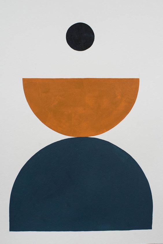
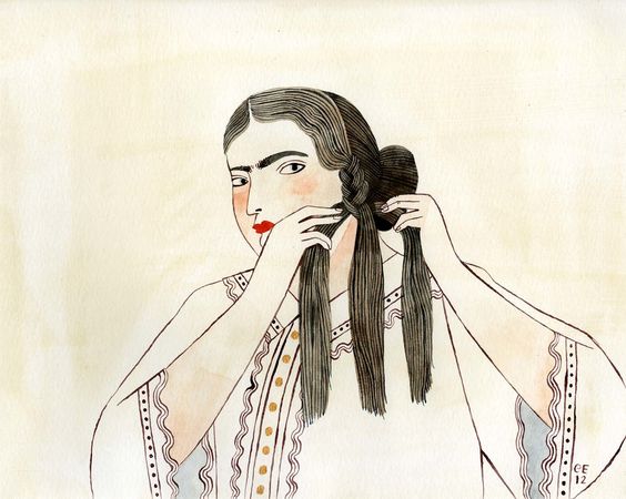
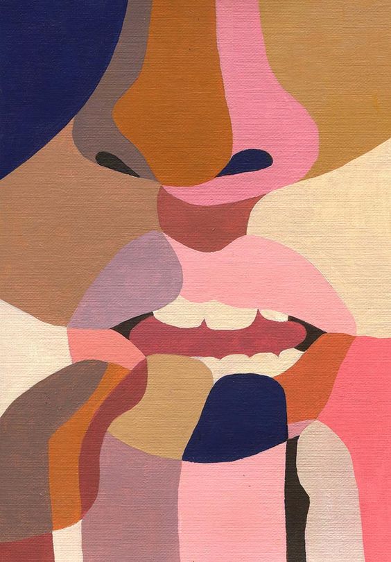
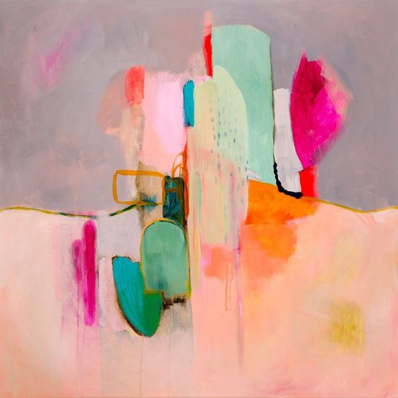
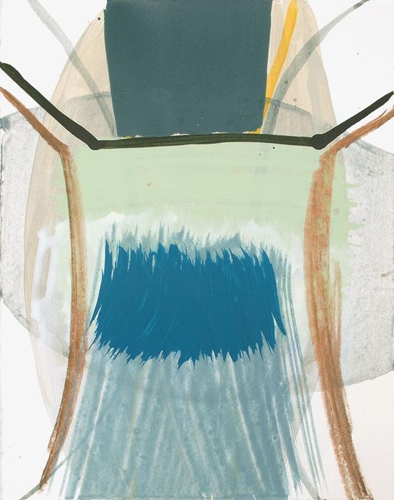
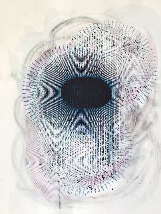
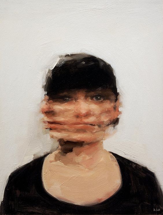
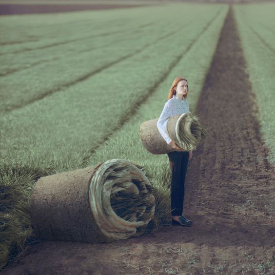
Finding affordable, art can be hard.. it's expensive! To find affordable art that is original, is even harder. This is one of the main reasons why I love to embrace new, up and coming artists. Often these artists have not only a fresh, new look, but more reasonable prices too. It's a natural blend from my background in art installation, and I'm always on the hunt for the talented and promising artists. Here is a quick list of a couple of my current favorite up and coming artists.


This lovely writer, Michael Shannon O’Keefe, reached out to me via email and said he was on the Homepolish website researching designers in the Chicago area for a piece he was working on. Every room he gravitated toward happened to be my work. Incredibly flattered, he asked to permission to use my work in his upcoming feature on Chicago, design in the city and fun things to do on the weekend.