The Sketch Book Files

Meet Jen!

Jen's spot for inspirations, inside her life as designer and artist. I share progress, tips on sources, spaces that inspire and how to push the boundaries of every space.

Be brave, and go for it.

xo, Jen

Posts in Chicago Interior Designer
Design Hack: Bathrooms for Teens

Author: Sydney Piwowar

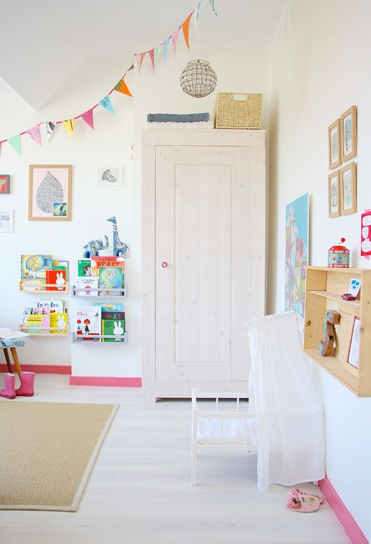
I did it myself as a kid, every year I wanted to re-do my room. For me, that was the first sign I wanted to become a designer, but for most it is the growing character and evolving taste of impressionable teens and pre-teens. This often leaves parents feeling frustrated as they just re-painted their room, or bought a new bed spread, new drapes, etc. We have all learned the hard way that a key to success in kids spaces is VERSATILITY.

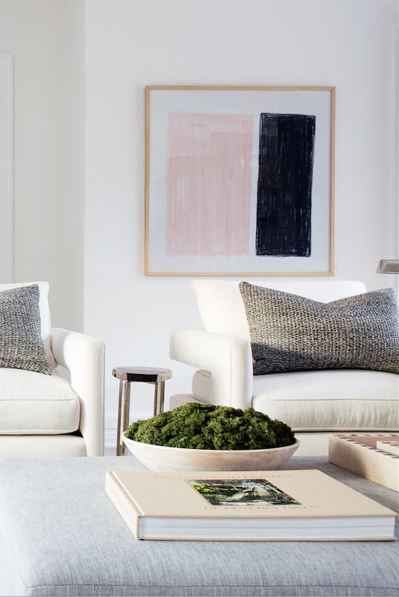
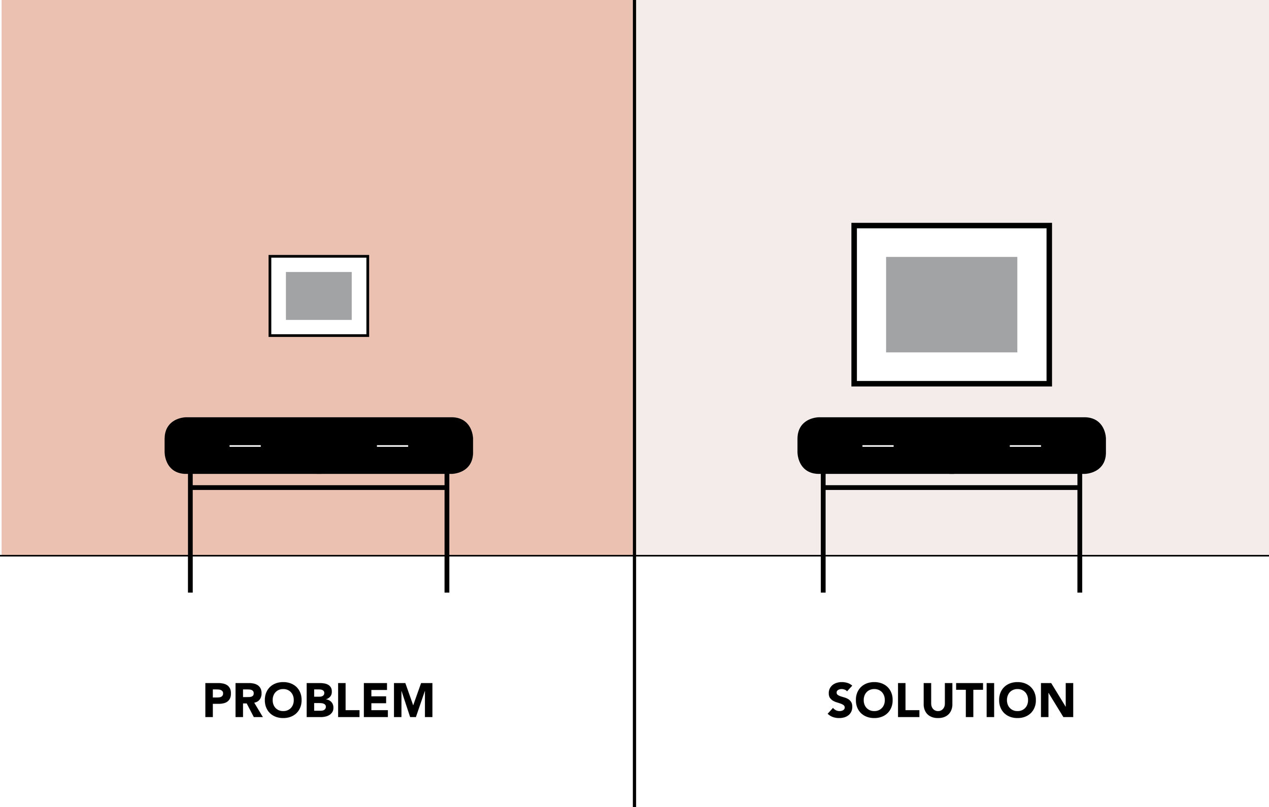
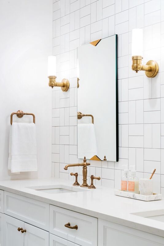
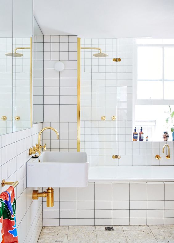
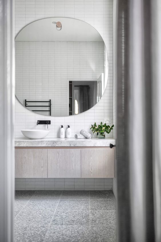
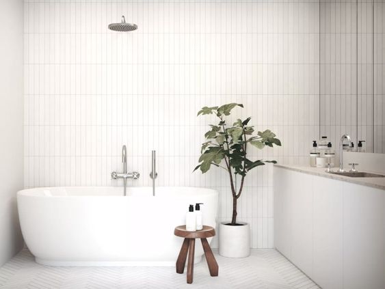
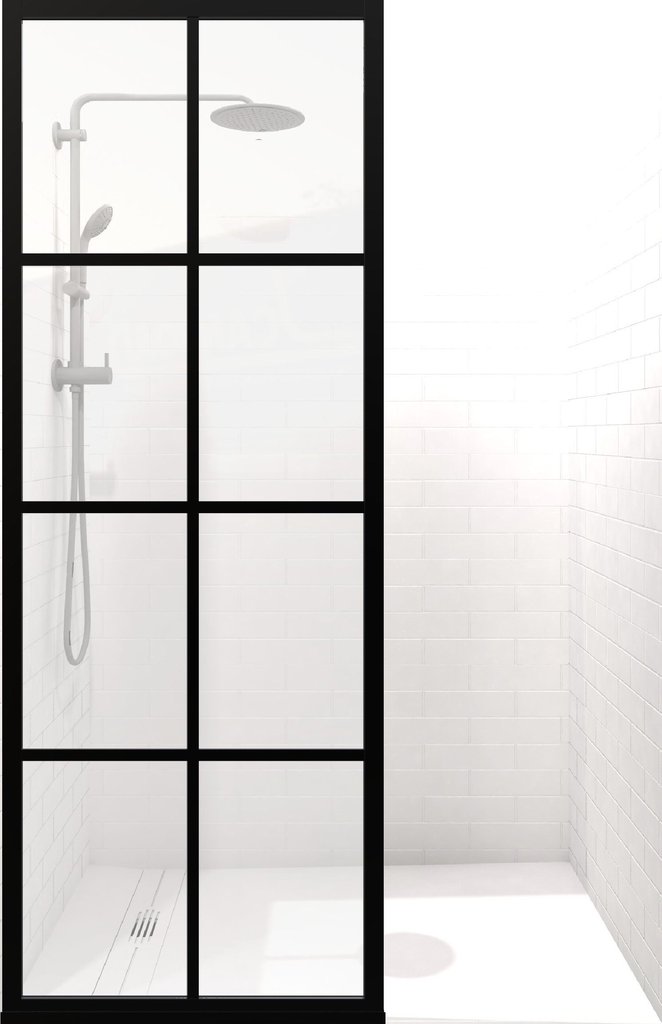
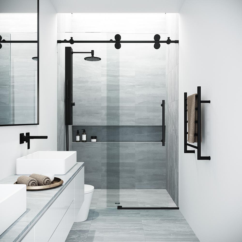
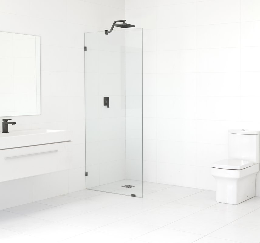
There a few places though that the term versatility doesn’t apply. One of them being Bathrooms… tile, wallpaper, plumbing, oh my… all so permanent. This is why it is important that you feel confident that the bathroom design and palette reflects the culture of your family. Whether it be more sophisticated or young and playful. The key to getting the most out of your space is to make sure it matches you and your life style.

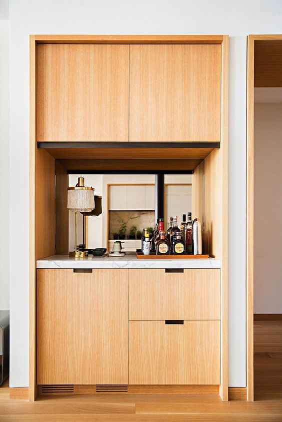
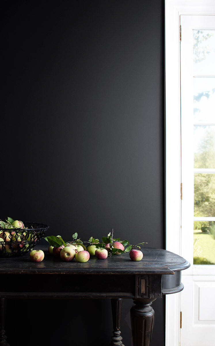
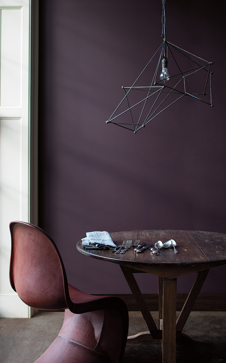
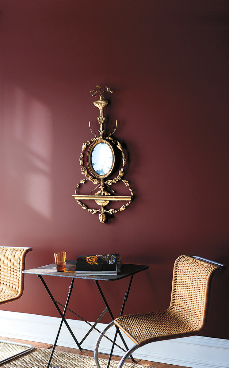
I have broken down design for teens into three palettes to match your family’s character. Check them out below and some Inso images for each!

Bold + Playful

Clean + Monochromatic

Bright + Cheery

Design Details: Contrast Piping

Author: Sydney Piwowar

Many of you may remember Jen’s previous post with her Hope for Autism submission. If you didn’t see it, I want to remind you to check it out, here. I bring it up because Jen and I are obsessed with contrast piping. It is such a simple, uncommon, and genius way to add character to furniture. Whether it is a simple color palette or something gold and colorful, we believe it is one of the easiest ways to turn an “eh” piece of furniture into a “WOW” piece. Here are our Top 5 Favorite Applications

1. To emphasize form

contrast piping 1.jpg

2. To give depth

contrast piping 2.jpg
 

3. To by playful

contrast piping 3.jpg
 

4. To be different

contrast piping 4.jpg
 

5. Cause why not?!

contrast piping 5.jpg
5 Monochromatic Tile Color Palettes

Author: Sydney Piwowar

I call it the “Modern Mural”. Artists used large scale murals to tell the most elaborate, and beautiful, stories through tile mosaics. So many different cultures have done this through the years and I think America has found its own. It features clean lines, purposeful choice of grout colors, and a hand made nature, expressing the amazing new technologies we have to impact our spaces. I have curated a few of my favorite images and combinations to inspire you and a tile guide to inspire your next renovation.

monocromatic 1.jpg
monocromatic 6.jpg
 
 
monocromatic 9.jpg
 
 
monocromatic 12.jpeg
 
 
monocromatic 15.jpg
 
 
3 Tips To A Perfect Dry Bar

Author: Sydney Piwowar

As society modernizes, I believe the perception of alcohol in the home does as well. Where once the home parlor was filled with cocktails and conversation, it turned to a plastic covered furniture living room. Now I believe we are in a full swing back to the original cocktail room we all knew and loved. Not every once looking to implement these in-home bars has the ability to add plumbing for a wet bar… This is where the Dry Bar steps in. It is the perfect space to call home for your best drink ware, wines and spirits. To elevate yours to the next level, I have curated 3 tips to make your Dry Bar the topic of the night!

Build It In

I know it isn’t a wet bar, so there is no need for built in components, but is important that it feels integrated into the home. If you are trying to add one into an existing structure, the easiest way to do this is to replace a built-in or unnecessary closet.

dry bar 1.jpg
 

Make It Feel Special

The most unsuccessful dry bars are the ones that feel left over kitchen cabinets you just put in the living room. They key to a good dry bar is to make it feel special. Consider special finishes on the cabinets, an upgraded stone counter top, a backsplash (could be tile, wallpaper, paint, etc.), and even lighting.

dry bar 2.jpeg
 

Add Lots of Storage

At first it will seem overwhelming because you have not began to curate your collection, but over time you will need it. Whether you need shelves for your Whiskey collection, or racks for your wine bottles, be sure to maximize on storage. Consider how your collection might change over time as well. For example, purchasing more glasses, changing from a red wine to white wine collection, will you need refrigeration?

dry bar 3.jpg
 

For more bar ideas, check out my painters page HERE!

Top 5 Edgy Kitchen Backsplash Ideas

Author: Sydney Piwowar

Tired of white subway tile? We are too.. While it is a great budget friendly option, we encourage you to find creative ways to give your space more character. You should feel free to explore color, pattern, and material! Here are our Top 5 Edgy Kitchen Backsplash Ideas to inspire you in your kitchen makeover.


The Unexpected

edgy kitchen 1.jpg
 

The Trend Setter

edgy kitchen 2.jpg
 

The Pattern Lover

edgy kitchen 3.jpg
 

The Luxurious

edgy kitchen 4.jpeg
 

The Glamorous 

edgy kitchen 5.jpg
Winter Blues Solved: 15 Low-Light House Plants

Author: Sydney Piwowar

It is officially Winter and in the Mid-West, we get to know something called the January Blues. Yep... thats the time right after the holidays, when there is nothing else to get you through the grey skies. This year, I refuse to let them get to me though. My trick to keeping positive is to surround myself with Green. It proven that people who expose themselves to more plants and trees are happier.

1. Snake Plant

Snake plants thrive on neglect and are considered “unkillable”. They don’t mind low light and they only need to be watered once every couple of weeks.

house plant 1.jpg

2. Spider Plant

Spider plants actually prefer you keep them away from direct sunlight. They are also pet friendly and sprout with babies you can re-plant.

house plant 2.jpeg

3. ZZ Plant

Even if you’re a serial plant killer, you’ll do just fine with a ZZ plant. It hails from Eastern Africa and it is conditioned to survive months of low light and drought.

4. Monstera Deliciosa

You’ve probably seen these all over trendy instagram pages. Monstera Deliciosa loves basking in gentle sunlight - keeping it 5-10 feet away from a bright window is key.

house plant 4.jpg

5. Peace Lilly

If you’d prefer a plant with flowers, peace lillies are for you! They thrive in shade, indirect light, and even windowless rooms. You’ll know if your peace lilly is getting too much light because they’ll show brown streaks.

house plant 5.jpg

6. Moss Terrarium

Terrariums hit the trends a few years ago and you can easily DIY one at home. With a little moss and rocks, they will survive on little to no sunlight. It does need moisture though and some indirect light to live at its brightest green. Place it near a window where it can receive a bit of reflected light.

7. Dracaena Reflexa

There are lots of types of dracaena, but reflexa is the most common. It is also the best choice for a dark room. They can survive in low to medium light, but are their boldest, yellow in indirect sun. However, too much will make them brown so don’t let them sunbathe all day.

house plant 7.jpg

8. Nerve Plant

Yes it is PINK! Be careful though and keep them out of direct exposure or their leaves will start to brown. They do need constant moisture, so don’t skimp on the watering. Another plus about this one is that they are non-toxic for pets!

house plant 8.jpeg

9. Cast Iron Plant

Cast iron plants are native to the forest floors of japan and Taiwan so they are used to very little light. As a matter of fact, direct sunlight will burn their leaves so keep them close to north facing windows or away from windows in general. Best of all, it is another pet friendly plant.

house plant 9.jpeg

10. Lucky Bamboo

Dracaena Sanderiana, aka “lucky bamboo”, is not only cool for its shape, but also because it survives in low to moderate light conditions. Just don’t put them in direct sunlight, which will burn their leaves.

house plant 10.jpeg

11. Birds Nest Fern

Filtered or indirect sunlight will do them well. East or north facing windows are ideal. Avoid exposing to direct light to prevent burn marks.

house plant 11.jpg

12. Chinese Evergreen

The pattern on these leaves are amazing. This one needs a bit more light than the rest, desiring low to bright indirect sunlight. they’re part of a family with 20 different species, but the general rule with all of them is that the darker their leaves and stalks are, the lower light they can handle.

13. Pothos

Pothos won’t complain if you only have moderate indoor light. It can also tolerate fluorescent lighting which makes it great for your office.

house plant 13.jpg

14. Prayer Plant

The name of this plant stems from the fact that prayer plants leaves lay flat during the day and then fold upward at night. Another cool point about them is that they are safe for pets and dimmer rooms.

house plant 14.jpeg

15. Philodendron

This one is super easy for beginner plant parents as it does well in low to medium light and wont freak out if you forget to water it from time to time. The cascading leaves look beautiful on a high shelf or a hanging basket.

house plant 15.jpg

See our pinterest board for more house plant ideas HERE!

Common Art Hanging Mistakes

Author: Sydney Piwowar

Art is crucial in making a house feel like a home, and good art is not cheap! Nothing ruins your perfectly good piece of art quite like bad nail placement. We have curated the top 3 mistakes that people make when hanging art and are going to share simple solutions.

Hanging Too High 

art hanging 1.jpeg

You have most likely hung your art too high, leaving it to float away from the furniture underneath. To tie the pieces together (and make your room more visually harmonious), shoot for roughly five inches of space between the bottom of your art and the top of your furniture.

Small Art in Large Spaces

art hanging 2.jpeg

Scale is the key to maintaining a harmonious relationship between the walls and furniture. Using a frame that is too small tricks the eye into thinking that is is smaller than it actually is. An easy trick to make it feel proportional is to reset it in a larger frame or to get a larger piece for the space all together. The general guide you should have when approaching art is to chose pieces that are about two-thirds of the length of the furniture.

Grouping Too Far Apart

art hanging 3.jpg

Separating your art is like separating fighting kids to their time-out corners… Its awkward for all of us. Whether you’re hanging twin paintings or simply grouping pieces, everything should act as one. Make sure that they are close, separating frames no more than 3 inches apart.

5 Steps to Tasteful Family Photo Wall

Author: Sydney Piwowar

We all love our families (mostly) and its hard to tastefully show them off. Oversized canvas oil paintings hung over the fireplace aren’t style anymore... At the same time though, I do not think it is fair to cut all evidence of family in a home… it is after all what makes a house, a home. We were asked in a recent install how to do this successfully. Well, I am here to share with you all my secret: framed prints with oversized mattes. Yes, simple and understated. What makes this method unique is the color quality of the image and the placement of it. Here are the 5 steps to ensure your framed prints turn out perfect:

Curate Your Photos

Go through the old hard drive because you want to plan out your photos ahead of time. The photos don’t all have to contain the same colors or people - feel free to change it up. This is where you get to show off your family’s unique characteristics.

Print With HIGH Quality

The most common mistake that people make is framing pixelated photos. Make sure that you are printing high quality images and don’t be afraid to send them somewhere nice to print - don’t cheap out on this because you will get what you pay for. Something else to consider is if you want to print in color or black and white. For someone who wants to print in color, going to a good printer with high quality color is important.

tasteful photo 2.jpg

Find Frames

Frames can be sourced from anywhere. Whether they are custom or ordered online from Ikea, you will notice a large gap in cost. The most influential decision you make will be upon the frame’s finish. This color and texture will be framing the image, literally and figuratively, in a way it is possible to influence your perception. For example, if your image has LOTS of texture and color, choosing a frame that does as well may only distract form the richness of the image. It would be better to chose a simple frame that allows all attention to be focused on the specialness of your image. The second factor to consider is if you want a more unified or eclectic gallery. For a more unified approach, I would consider finding a store that sells the same profile in several sizes as you may need for your collection. For those that want a more mix-and-matched approach, I suggest shopping resale shops, garage sales, and local boutiques for an interesting combination.

tasteful photo 3.jpg

Find Matte

There are several colors and finishes to matte. I prefer a stark white matte as it gives a certain freshness. Be careful though as they come in several shades of off-white, ivory, and cream — especially if you are trying to match to previously framed images.

tasteful photo 4.jpg

Hang Art

It is hard to generalize for every one when it depends on the size of the frame and the space… My best tip is to map out the wall with painters tape first though to ensure you are happy with your placement — you don’t want to see a dozen holes in the wall from where you moved hung them previously. Some key areas I think it is more peaceful to hang family photos include: hallways, stairways, bedrooms, bathrooms, and basements. Try to stay away from the large print over the living room fireplace — its tacky.

tasteful photo 5.jpg

For more tips on how to frame family portraits, see my pinterest board HERE!

5 Steps to a Modern Holiday Table Setting

Author: Sydney Piwowar

1. Pick a Theme

This year, I am keeping a simple Scandinavian winter theme with a neutral palette. Natural textures, greenery and soft candlelight create a relaxed setting where the focus can be on the great food and conversation around the table.

holiday table 1.jpg

2. Simple Textures

Layering up textures is very important. Here, starting with a layer of white linen sets a soft tone. A rough grey linen runner lines the table adding needed balance against the perfect white. Notice that the grey and white tones call back to the dive grey dishes set on the table.

3. Natural Accents

They say that scent is the strongest memory trigger. The smell of pine at this time of year reminds me of all the great holidays of my past and to come. Using the left over tree trimming is an easy way to add a more festive feel to any holiday table.

4. Add Height

I don't like focus of a table setting to be down. I like to give the eye eye freedom to travel around the room. One easy trick is to add height which is easily done with the addition of a few tall candlesticks. In the winter months, candlelight is essential to any gathering. Burning candles creates the ultimate cozy ambiance. Another trick to fill up a larger table is to add a combination of tall candlesticks and low tea lights scattered along the table foliage so there's light at different levels. 

5. Simple Accessories

Black and brass candle sticks are a simple, yet gutsy way to go. This trend pays homage to traditional candles, but adds a fun and celebratory feel. This is also an opportunity to showcase special occasion cutlery that is more exciting than the everyday stainless steel set. Textured or patterned napkins serve as a pop against the white setting here.. Tying the edgy black stainless steel in with the rest of the clean, elegant, table setting.

To see more amazing table setting inspiration images, check out my Pinterest board HERE!

Top 10 Office Chairs

Anyone who has ever worked in an office, designed an office, or sat in an office before knows this struggle. Pretty and practical do not meet in Office chairs. We have all seen the Knoll, Steelcase, an Herman Miller office chair solutions. They are some of the best office chairs on the market. Only issue is that they are not terribly attractive. We searched the market and curated a few chairs we guarantee meet all your needs. 

Baxter

CB2

office chairs 3.jpeg

Gubi

office chairs 4.jpg

West Elm

Steelcase

office chairs 6.jpeg

Arper 

office chairs 8.jpg

Sean Dix

Suite NY

For more inspiration, take a look at our Pinterest board: Attractive and Ergonomic Chairs

Best Soft Touch Matte Finish Paint

Author: Sydney Piwowar

Benjamin Moore released a new line of paint in 2017 called Century. It is the world’s first Soft Touch Matte Finish paint with never-before-seen depth in 75 exclusive colors. We are obsessed with the level of depth in these colors and find it is very comparable to the infamously expensive Farrow & Ball line. The best part of these soft, cozy colors is that they are curated to look good all year long. See our Top 5 below!

Tips on Subway Tile Patterns

In the last 10 years of its rise, we have seen the good, the bad, and the ugly of subway tile. Everyone loves it though - its simple, easy to clean, and inexpensive! Despite its versatility, I cringe when clients ask for the classic subway pattern. There are so many amazing ways to lay tile, why should we limit our selves to the Running Bond pattern? I say no. I say get creative. If you aren’t sure where to start, I have curated some of my favorite LUXURIOUS & MODERN ways to lay the classic tile.

Cross Hatch

The 4-Stack Parquet

Different Scales

Combination: Traditional + Diagonal Herringbone

subway tile 4.jpg

Stacked Bond

Vertical Stacked Bond

Top 5 Black Framed Shower Doors

Author: Sydney Piwowar

When they became a trend back in 2017, you had to pay BIG bucks for these beauties. Now that the trend has set in though, there are so many amazing vendors selling them stocked and ready for you! Here is our round up for Top 5 Black Framed Shower Doors.

For Large Showers

shower doors 1.jpg

For Small Showers

For Industrialists

For Minimalists

shower doors 4.jpg

For Those On A Budget

For inspiration on matching hardware and bathroom accessories, see our blog post on Design Details: Toilet Paper Holder and The Anti-Trend: Black Hardware.

Top 5 Interior Glass Walls

We were all in shock when the trend hit in early 2017 and have been drooling over them since. Black powder coated steel framed glazed partitions. In other words, those beautiful black framed window walls that we are seeing in interior spaces. After the swoon faded, I discovered a very practical issue with these walls… Arent walls supposed to separate spaces and provide privacy? Well, not these ones. The goal of these window walls are to separate zones in space without compromising on light, still maintaining the open feel of the space. To prove it to you, I have rounded up our top 5 favorite PRACTICAL applications for these.

1. Interstitial Spaces

Interstitial spaces can be a pain to design. Often, they become this weird in-between space with no purpose other than to offer a transition in space. These glass walls offers a connection from the outside in, making a smoother and aesthetically pleasing transition.

2. Studio Dividers

Anyone who has ever owned a studio apartment or condo knows the struggle of defining zones within a larger, open space. We have seen endless Ikea temporary hacks, but for those who are in it for the long run, this offers a solution that embraces your small space.

3. Quiet Zones

Since the development of open concept, our clients have come to us with lots of noise control issues. Families are finding that noise carries through the house in unwanted areas. No one wants to hear the kids playing cops and robbers while you’re trying to make a work call in our home office. These glazing walls offer create barrier between spaces, blocking some sound, and separating quiet spaces like your office.

4. Stair Railings

It sounds contradictory to build a wall to open up the space, but this glazing wall offers a protective railing for the stairs without the cluttered, repetitive lines of balusters.

5. Messy Spaces

There are some spaces, like mudrooms, that unfortunately receive a lot of light as they are connected to the exterior of the home, but get VERY messy. Frosted glass partitions offer a way to carry in that light without seeing the mess! This can be a great solution for spaces like kids play rooms, pantries, offices, etc.

This is a steel and glass wall we did for a modern condo in the West Loop to split the master bedroom from the main living area. We also had custom cast brass door handles made.

Design Details: Toilet Paper Holder

Author: Sydney Piwowar

I have decided to start a series called Design Details where I touch on the details of a space. There are so many little things that effect your every day life that people don’t think about. This week topic is: Toilet Paper Holders!! Yep. That’s right. Everyone has a specific method they prefer (upright, side ways, open ended, spring bar, etc.) Who knew there were so many options?!

I have curated a list of a few of my favorites to liven up a very practical detail in design.

Design+Details-+Toilet+Paper+Holder+-+JTD.jpg
Ottomans To Make you Kick Your Feet Up

Author: Sydney Piwowar

Some people have those rooms where you better not get caught with your feet on the table - we encourage COMFORT at JTD. If you can't live in your home, then your home isn't right for you. Ottomans are essential for kicking up your feet and settling in after a long day. Not only are they very practical, but can be beautiful accessories. Take a look at a few of our favorites for getting cozy this fall!

The best part about ottomans is that in small spaces, they can double as an extra seat! Here are a few sturdy stools we love for their functionality and looks!

For more inspiration, go to our Pinterest page: Ottomans + Stools

How to Design a Wet Bar in 5 Steps

Author: Sydney Piwowar

Step 1. Pick out your storage method

Will this include open or closed storage? Will you need to store bottles? Glassware? Both? Will you be including a refrigeration system?

Step 2: Pick out your Plumbing Fixtures

Never doubt the importance of plumbing fixtures in small spaces.. Every detail counts.

Step 3: How to finish your backsplash/wall

Paint, wallpaper, and tile OH MY! So many options.. This is a great space to showcase a pop of color or pattern.

Step 4: Cabinet Hardware

Cabinet hardware can be a great accessory. In this image below, the lack of hardware makes a much more powerful impact on the space.

wet bar 4.jpg

Step 5: Style and Accessorize

Here is your opportunity to showcase your bar tools, coasters, and beautiful glassware.

Top 5 Trim Options that AREN'T White

Author: Sydney Piwowar

Contrast trim became famous for providing non-contractor grade options for trim. It was a missed opportunity for years to provide another aspect of color and depth to space. Rather than just picking the base grade or what ever is cheapest at Home Depot, we encourage you to put an interesting spin on a building necessity. Here are our current Top 5 Favorite Contrast Trim Colors now.

1. Classy Black

We have all heard of the black trim trend at this point. At JTD, we appreciate the unique ways people are using black in space. Here is a great space where the designer chose to trim a unique white wallpaper with black.

2. Calming Grey

Although providing a visual contrast, this soft grey brings a sense of comfort into the space.

3. Eclectic Green

We love the way this emerald toned trim compliments the original stained glass windows. This is a great way to modernize traditional spaces.

4. Pretty In Pink

If your kids are anything like I was, they constantly want to update their room. An easy, non permanent way to do that is to paint trim. No need for painting or wallpapering whole walls.

5. Buoyant Blue

This soft, baby blue paint color was pulled to compliment the paper pattern.

Unexpected Wallpaper Applications

Author: Sydney Piwowar

Behind Built-Ins

This modern geometric pattern provides a sense of luxury and relaxation in this classic application.

Inside Kitchen Cabinets

Look how GREAT Kelly Wearstler Channels Wallpaper POPS against these crisp white cabinets.

Inside Closets

I love the fact that no matter your closet size, you can add an element of design to a space that is primarily just functional.

Stair Risers

This contrasting wallpaper mural completely changes the mood of what could have been a boring, white space. Love the sense of artistic creativity added here.

Stair Stringer

Over Doors

Doors don’t need to be boring anymore. There are so many great peel and stick wallpapers out there that you can use on flat panel doors.

Unexpected wallpaper 7.jpg

Upset because you don’t have flat panel doors to do this to? Don’t worry! You can totally apply this method to trimmed panels too. See below.

Framed Wallpaper

Wallpaper is a work of art.. Framing your left over wallpaper or samples is a great way to showcase your favorite patterns without the permanence of pasting it to a wall.

Brass Swing Arm Sconces

Author: Sydney Piwowar

Heres the truth about swing arm sconces - people are too afraid to use them. A light that attaches to the wall and sticks out far into the room can be intimidating because it is very permanent. Their placement can determine the layout of a room. With the help from your favorite designers at JTD, we are here to tell you that they are aren't scary. They take a designer with the right experience to make sure you are putting them in the right place for your space. We have curated a few of our favorite applications to prove it to you. 

1. Ambient Lighting — Long Swing Arm Sconce

2. Bed Task Lighting — Short Swing Arm Sconce

3. Direct Lighting — Short Swing Arm Sconce

4. Task Lighting — Bent Swing Arm Sconce

5. Spot Light — Directional Swing Arm Sconce